by Hakki Etem
Size matters
The traditional mortgage industry is all about volume: increasing the number of closed loans. Volume growth can be achieved through mergers with other lenders, by expanding a lender’s business channels, or by increasing the productivity of existing origination staff. Excellent accounting systems exist to track loan points, fees, spreads, and servicing values by production units. Compensation of mortgage staff – from senior management to mortgage brokers to line loan officers – is tied directly to gross volumes achieved.
Quality matters, too
It will come as no surprise to this group that quality also matters. If the focus is on the bottom line, rather than simply on gross revenues, then the cost to a lender of poor quality cannot be ignored. All of the means of volume growth mentioned present new challenges to loan quality – left untended, loan quality often declines as production volume increases. Unfortunately a lender’s ability to monitor the direct costs of poor quality are typically weak and incomplete. One problem is that lenders have generally not been interested in a formal calculus of poor quality’s costs (we’ll make it up – whatever it is — in volume!). Another problem is that the calculation is relatively complex and requires statistical sophistication.
The Costs of Poor Quality
At previous Cogent Quality Symposia we identified a number of quality cost components, including: repurchase cost, fraud losses, regulatory fines and penalties, civil claims and liabilities (see predatory lending), delinquency loss, loss on foreclosure, increased servicing costs, and the cost of fixing defective loans. At the loan level, it is entirely possible that a given defective loan may incur none of these costs – just as one could survive unscathed a few rounds of Russian roulette. But we can say that the risk of such losses, at the portfolio level, has increased and that we can expect overall quality losses to increase. To quantify the estimated average cost of poor quality at the loan level, a lender must first estimate, at the portfolio level, (1) the increased risk that a loss event will occur, and (2) the average severity of the loss event. For example, if a critical underwriting error results in excessive debt-to-income ratios, the loan may be at a higher risk of becoming seriously delinquent. QC findings might reveal, in other words, that reviewed loans with similar underwriting errors were three times as likely to become seriously delinquent as comparable reviewed loans. This estimate of increased risk would be multiplied by the average cost to the lender of a seriously delinquent loan (including the greater likelihood of foreclosure and associated losses) to estimate the loan’s hypothetical cost. This cost would offset the dollar benefits (points, fees, etc.) in a calculation of bottom line profitability per loan.
Rewarding for Good Quality
Lenders attempting to improve loan quality often look to add a quality component to compensation plans. For production staff, this means changing the bonus structure from one based exclusively on volume to one that includes multiple components, including volume and quality metrics. Although we might all agree that improved loan quality is a worthy goal, all too often the quality metrics used by lenders do not serve the goal. And sometimes they actually sabotage the quality initiative, in my experience, by rewarding poor quality originators and penalizing high quality originators.
Reliable Statistical Reports of Comparative Loan Quality
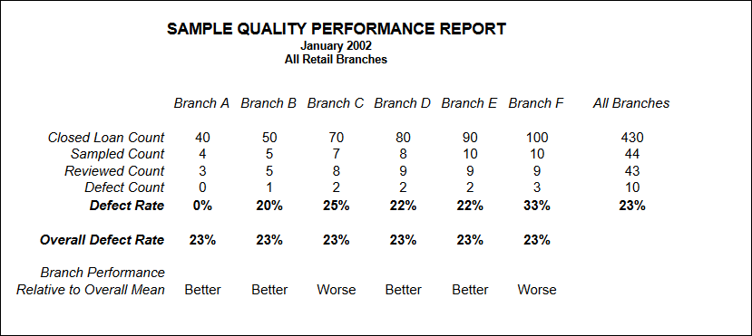
Good performance metrics represent a sophisticated statistical report. The word “statistic” can be defined simply as a number, and as such, statistics present only a limited perspective that is wholly dependent on the particular context – without a context, numbers are largely meaningless. Statistics presented in an incomplete or inconsistent context often distort an objective representation of reality. (see “How to Lie with Statistics”) Poorly crafted performance metrics are usually based on a flawed context.
Basics of Sound Inferential Statistics
Sample findings are useful because we can make an inference to the population from which they are drawn. The population is part of the sample context, and there are many opportunities for the analyst to distort the context inadvertently throughout the review process.
1. Non-static Population (process period vs. review period)
2. Non-random sample (adverse selection)
3. Excessive Sampling Error (insufficient sample size)
4. Non-response bias (file not available)
5. Ad hoc definition of a quality loan (case by case negotiation)
6. Non-sampling Error (Inconsistent reviews and “fixed” files)

Quality Performance Benchmarking – Source Units
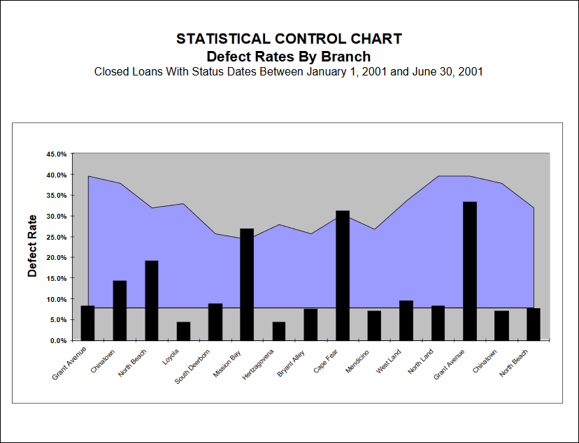
Statistical process control charts, employed soundly, offer an excellent quality benchmarking tool. When comparing source units – regions, branches, brokers, correspondents – use the overall loan quality assessment: acceptable or defective.

Quality Performance Benchmarking – Staff Positions
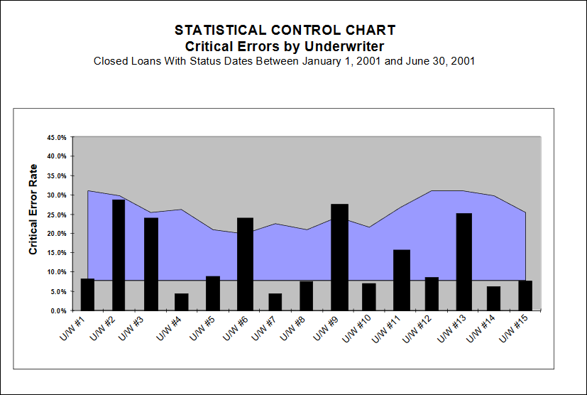
Statistical process control charts are also an excellent tool for comparing quality within a given staff position (loan officers, underwriters, appraisers, etc.) When comparing staff, however, do not use the overall loan quality assessment. Instead, use the count of critical errors (and/or non-critical errors) with the appropriate assigned responsibility code.

Control Charts in Detail
♦ Because we are using samples to determine variations in a population, the application of Inferential Statistics is required.
♦ Statistical Quality Control (SQC) is the branch of QC which involves the collection, analysis and interpretation of data for use in QC.
♦ The goal of SQC is to improve the production process by identifying sources of variation, developing corrective actions, and thereby achieve improvement in quality.
♦ Any process is defined as statistically unstable if there are unexplained sources of variation in that process.
♦ The basic approach of SQC is to identify statistically unstable processes and modify them to achieve stability.
Diagnostic approaches to SQC involve the determination of variation. Any process, no matter how perfect, will generate some variation in output.
♦ When sources of variation fluctuate in an expected manner, a pattern of random causes (chance causes) of variation develops. Chance causes of variation are inevitable, and because they are relatively small, they are difficult to detect.
♦ Other causes of variation that are large and easily identified are classified as assignable causes.
♦ When only chance causes are present in a process, that process is considered to be in a state of statistical control. When an assignable cause is also present, variation will exceed normal limits, and the process is considered to be out of statistical control.
Control Charts provide a method for indicating when observed variations in quality are greater than could be left to chance.
♦ A Control Chart is a graphical representation of the central tendency and dispersion of a set of observations (defects).
♦ Control Charts are based on the fact that chance variations in quality fall within limits that can be calculated; the upper limit of chance variations is called the Upper Control Limit; the lower limit (if it exists) is called the Lower Control Limit.
♦ The concept involves dividing the production process into a series of subgroups, taking a sample from each subgroup, and calculating the upper and lower control limits of the distribution of defects. Any production unit whose average defect rate falls outside of those limits is considered to be out of statistical control.
♦ For example, if we consider each Retail Branch to be a production unit in the mortgage origination process, then we can select samples from many branches and compare their defect rates; if all rates fall within the control limits, then only chance variations are present and the process is in control. If one branch has defect rates outside the control limits, then some unknown (assignable) cause is present, and the process is out of statistical control.
♦ Just because any process is in statistical control does not mean that it is capable of meeting specifications; it is quite possible to have a stable process generating non-conforming output (e.g., all retail branches could have average defect rates of 50%, but still be in statistical control).
♦ Conversely, just because any process is out of statistical control does not mean that it is not meeting specifications; it means that some assignable cause of variation is present in the process.
Control Charts were developed by W. A. Shewhart of Bell Telephone Laboratories in 1924. This was considered the beginning of statistical quality control.
♦ In 1950, W. Edwards Deming, a SQC student of Shewhart’s, gave a series of lectures to the CEOs of Japan’s largest corporations on QC.
♦ In 1954, Joseph M. Juran (a student of Deming and Shewhart) made his first trip to Japan to emphasize management’s responsibility for quality control.
♦ Using these concepts, the Japanese established the world’s first QC program, and set the quality standards which the rest of the world followed.
There are some conditions which must be satisfied in order to utilize Control Chart methods.
♦ The production unit defined must be a rational subgroup, i.e., it must have a demonstrable relationship to the output being measured (e.g., measuring defect rates by borrower last name is not meaningful).
♦ Each rational subgroup must have a minimum sample size, usually 15 to 20 observations.
♦ The type of Control Chart applied must fit the statistical parameters of the set of observations (e.g., variable subgroup sizes measuring defects require application of a u Chart, called the Control Chart For The Count of Nonconformities Per Unit).
♦ Finally, the nonconformity being measured (i.e., defect rates) must be independent (i.e., the occurrence of one does not increase the likelihood of another).
Cogent Systems will automatically construct Control Charts from your database (Main Menu – Administrator Tasks – Reports – Management Reports – Control Charts)
♦ You select the date range and the source unit (i.e., branch, region, correspondent, broker, etc.) to be used as the subgroup, and the System will survey the database to see if enough data exists to prepare a chart.
♦ If enough unit samples (of adequate size) exist, then the System will present a grid allowing the User to specify which subgroups to be charted.
♦ The System will then collect the data, determine the upper and lower control limits and the average defect rate (for all subgroups), and prepare the chart.
Interpreting The Control Chart
♦ If all observations (i.e., defect rates) fall between the upper and lower (the lower is usually zero) control limits, then the process is under statistical control. This does not mean that the process is meeting specifications or is sustainable.
♦ If any subgroup has a defect rate above the upper control limit, then that subgroup is out of statistical control. This means there is an assignable cause contributing to the variation.
♦ When you observe a subgroup out of control:
– Verify your measurement of defects (i.e., review the QC reviews)
– Determine time trends for that subgroup (is the problem increasing)
– Identify common errors in the process (the assignable cause)
– Implement a QC response throughout the System
– Increase scrutiny of that subgroup (targeted sampling)